
Wednesday, 16 May 2012

Zoomed in images of the top


Process of making the top
When making this top I came across a problem, I had to figure a way out of attaching all of these small pieces. I could not sew them on because the stitching would take away from the little bits, and would not stay still under a sewing machine just making it look messy. There was also the concern of time, I had a limited amount of it, to get the piece finished, and sewing would have taken ages!
I came to the conclusion of using bondaweb. I put all of the pieces so they slightly over lapped each other and ironed them all on, this was very time consuming but I imagine the sewing would have taken longer, and with the bondaweb it did not add anything extra to the pieces- as to not distract from the small pieces.
I am really please with how the top has worked out, the bondaweb worked perfectly and they have stayed on completely. Using the iron to bond them on burnt the edges even more which added a lovely effect.
I did a rectangle of them in the middle, because it is a simple shape that would not distract from the garment and show the fabric pieces of nicely, and it gave them a nice border of white. I personally am a fan of semitry and I think that is a another reason I chose to do this.
Ironing the piece on was fairly simple, although a few bits got stuck to the underside of the iron and I manged a ruin it (well the iron). Some of the bondaweb in the spaces between with no fabric on top got stuck and bunt to it.


I came to the conclusion of using bondaweb. I put all of the pieces so they slightly over lapped each other and ironed them all on, this was very time consuming but I imagine the sewing would have taken longer, and with the bondaweb it did not add anything extra to the pieces- as to not distract from the small pieces.
I am really please with how the top has worked out, the bondaweb worked perfectly and they have stayed on completely. Using the iron to bond them on burnt the edges even more which added a lovely effect.
I did a rectangle of them in the middle, because it is a simple shape that would not distract from the garment and show the fabric pieces of nicely, and it gave them a nice border of white. I personally am a fan of semitry and I think that is a another reason I chose to do this.
Ironing the piece on was fairly simple, although a few bits got stuck to the underside of the iron and I manged a ruin it (well the iron). Some of the bondaweb in the spaces between with no fabric on top got stuck and bunt to it.


Illustrations
I wanted to incorporate the left over pieces from the laser cutter in my final out come but I was not to sure how I would do that. I did some experimental illustrations using the actual pieces on a plain figure to see if I could get some inspiration. As seen in the illustrations all of the idea are on a large scale using lots of the pieces. These ideas are very unrealistic, not only on the scale, but the amount of pieces I would need to make these. Obviously I had a limitation (because of how many small pieces I have). I needed to make a smaller scale piece that would tie in with my shorts, these illustrations gave me the idea of putting them onto a crop top the was donated.
The amount of left over pieces should just about cover a section of the top, I think the white with pale blue on it will show the pieces off nicely, and bring out the slightly burnt edges of the fabric (burnt edges from the laser cutter).


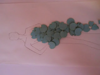


The amount of left over pieces should just about cover a section of the top, I think the white with pale blue on it will show the pieces off nicely, and bring out the slightly burnt edges of the fabric (burnt edges from the laser cutter).


Relevance of my project
Looking in a series of magazines I have been assessing my project, to see if it fits in with modern fashion. The powder blue looks like it is one of the main colours for SS2012 and this concept of beauty, fragility, and femininity, which I feel the light weight pale fabric I have produced starts to show signs of these ideas seen in this season fashions.
Pages from ELLE magazine;


Pages from ELLE magazine;


Louis Vuitton
In the Louis Vuitton SS2012 collection expresses ideas of femininity, delicacy, beauty, and youth. I felt like this campaign linked very well to my personal ideas for my final outcome. The fabric are all powder/pale colours- like my usage of powder blue- and very delicate. There is a series of designs using an enlarged lace cut out fabric, this gave me inspiration for my laser cutting ideas- although theres is on a much larger scale it is a similar idea. A blog I found online is very nicely layed out with images from the show- which is where I got this image from - http://golden-slumber.tumblr.com/

Swapping samples
Seeing as our project was about the 'community' and working together as a group producing work that reflected more than one persons culture-personality-thoughts; and blending different cultures. Swapping the samples was a fantastic idea, the outcomes were brilliant. The samples were unique to begin with- but in relation to each of our own projects. Swapping the samples allowed them to transcend the personal projects and become part of the 'community' project expressing more than one idea. The idea of taking someone else's personal sample (and therefore thoughts) and then finding a unique way to relate this already existing piece of fabric to our own projects is an interesting thought- actually if you think about it this exercise represents our entire project- in that we started off experimenting with existing fabrics to work with- using different companies and people ideas and working them into our ow projects. Waiting to see the samples added a scene of excitement to the who thing, we did not discuss to a full extent what we would be doing to each others work so when we all saw them after it was very cool seeing how they had changed.
I feel we should have done this earlier and more often because they turned out so well and tied the project together.
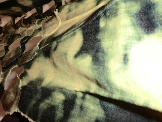
I personally swapped with two people; David and Beth. Their samples were beautiful and I did not want to alter them to an unrecognizable level- Also now focusing on pale washed colours (like the power blue) I felt it would be relevant but still not take away from their designs, to bleach the colour out of them.
David's Sample




Beth's Sample

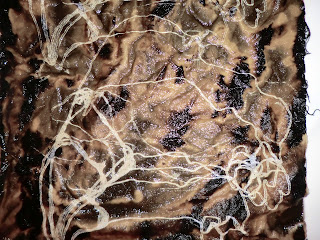


I feel we should have done this earlier and more often because they turned out so well and tied the project together.
I personally swapped with two people; David and Beth. Their samples were beautiful and I did not want to alter them to an unrecognizable level- Also now focusing on pale washed colours (like the power blue) I felt it would be relevant but still not take away from their designs, to bleach the colour out of them.
David's Sample


Images above when the sample was wet

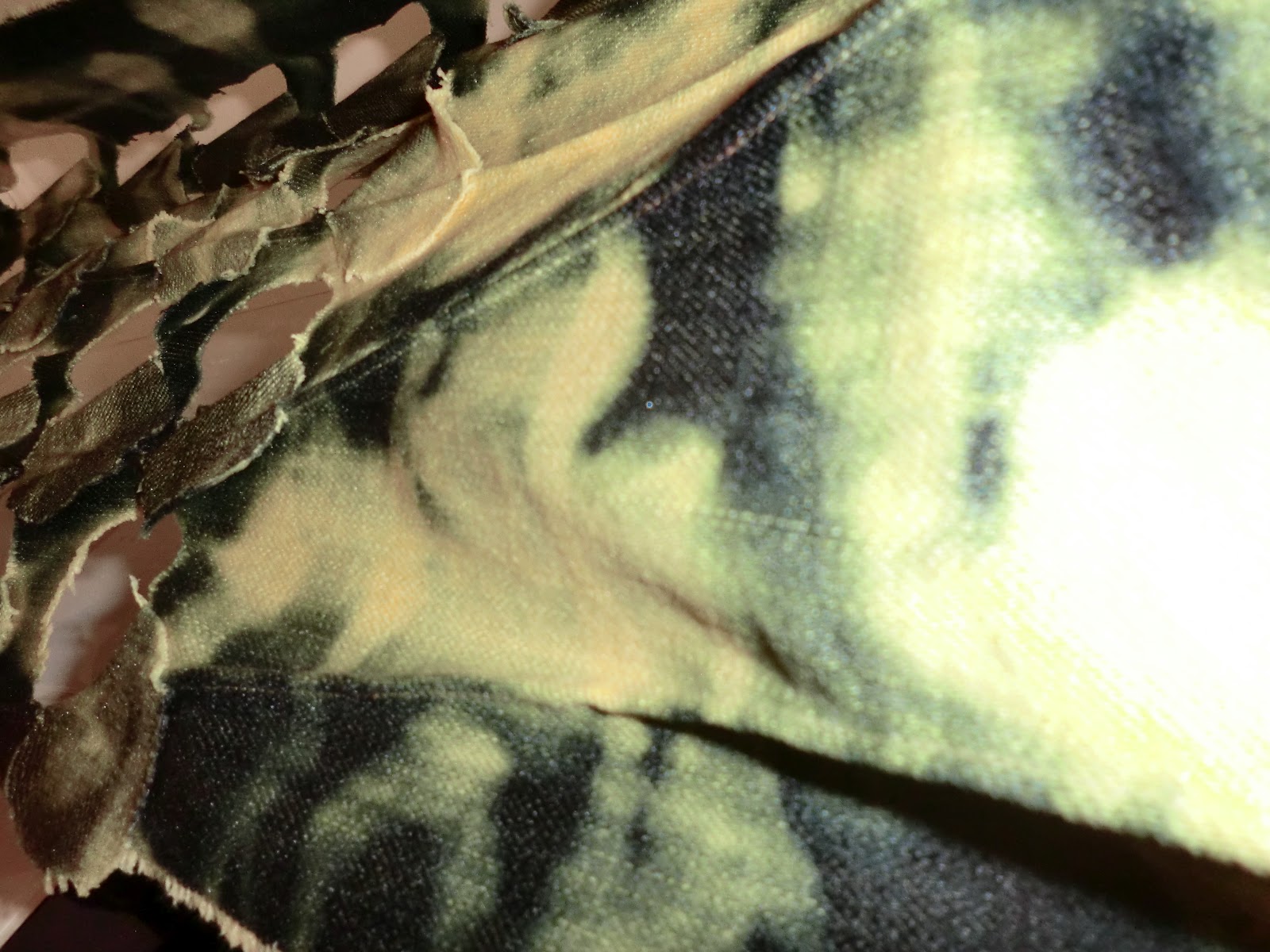


Beth's Sample


Subscribe to:
Posts (Atom)