Assessing my samples there are a few which have worked the best, and have qualities I plan on further developing. The first, laser cutting- although I haven't actually produced any samples of my own using the machine, seeing the samples that were on show there and other garments I have seen previously have lead me to believe that the outcome will be very effective.
The second is the Embelisher machine- the idea of bonding two fabrics together produces some very interesting effects, the machine also gives the fabrics a withered look and can bring pattern through ever so slightly onto a plain fabric.
The third is print- the first screen I had made ripped a bit so the technician has made me a second. tomorrow im going to experiment with the ideas of layering the screen printing using different colours, flock, and foils. From now on im going to focus (for the most part) on using blue and different shades of the colour. One such print im going to experiment with, was the printing onto bondaweb and then ironing the material on. Im thinking if I don this and iron it onto printed fabric i will get a better effect (the colour showing up more).
Monday, 30 April 2012
Sunday, 29 April 2012
Indigo dying

Shorts- Deconstruction
I have taken to a pair of shorts that were donated to us, Im not sure if its the feel of the fabric, cut or purely the colour that has drawn me in. But im planning on using them for a potential finally outcome piece. On Friday I was inducted to the laser cutter and im planning on using these shorts as fabric. Ive taken them apart and recorded through image, the process. Im thinking of using one of the designs ive been experimenting with, but we'll see if it goes as well as im hoping it will !
Rubbing samples


Bondaweb sample
Once again using screen printing I printed the same image ive been working with, but instead of printing it onto fabric, I printed it onto 'bonda web'. The bondaweb went all wrinkly which made it difficult to peel the backing off once I had ironed it on, but it turned out to be very effective, and gave it a bit of a withered look. I ironed the bondaweb on two different types of fabrics; one light blue spanex-y fabric with a bubble effect on it, and the other a blue polyester. Both samples turned out very well and im thinking of working with it more, because the image has been printed onto bondaweb the colour stayed very vibrant no matter what is below, my theory is that if I iron some other images onto fabric with a pre-exisitng pattern behind it that the image may show up better.


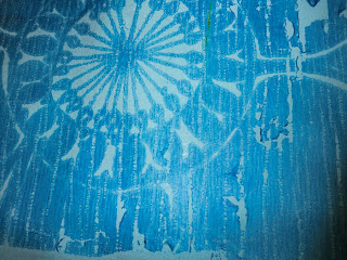


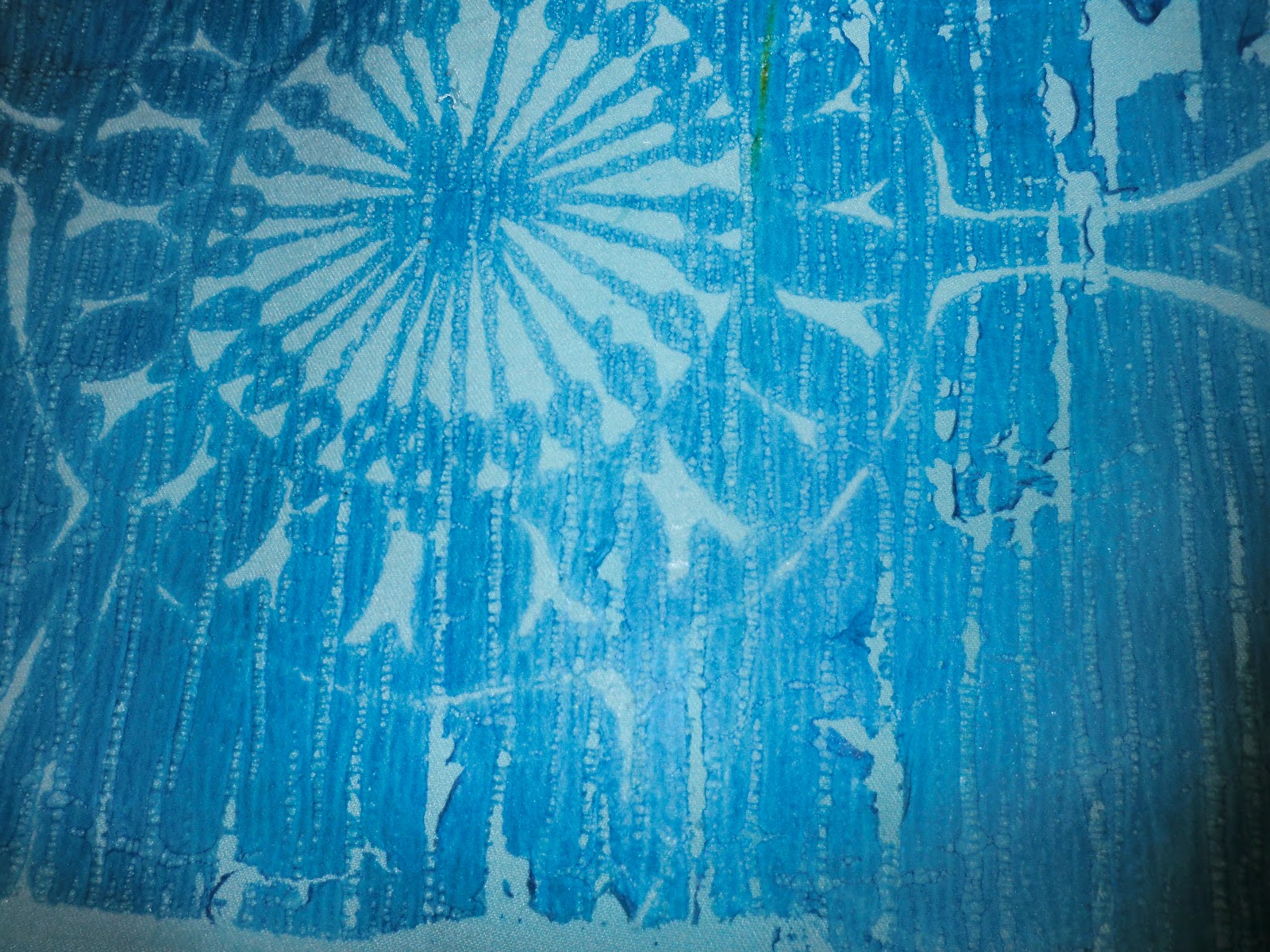
Wet print - Islamic window inspiration

Blue wet print samples


Another
selection of screen
printing except in blue- the first image is the same image as before
just double layered using a slightly darker blue (printed on twice). On
the second image im thinking of layering it with a fabric thats got a
pre-exisitng print on it (donated top) and bonding them together using
the embelisher.
Wet Print samples


Embelisher samples
Using the clothing donated to us, I started bonding them together (printed fabrics with plain ones) fabrics that frayed worked better, the sample layering an orange jumper and a printed top worked the best, the side with the print had some orange elements and on the reverse side the print came through onto the orange jumper.


Ive used these samples for the 'Dress Code' project our group is also working on, I gained inspiration for these samples from my visit to Whitechapel. I was exploring ideas of clashing cultures, layering, and hidden places. The picture below is the image which most inspired me.


Ive used these samples for the 'Dress Code' project our group is also working on, I gained inspiration for these samples from my visit to Whitechapel. I was exploring ideas of clashing cultures, layering, and hidden places. The picture below is the image which most inspired me.

Transfer paints samples


A bit of an issue I ran into while doing the other samples was that the transfer paper and the transfer inks work better on synthetic fabric rather than natural ones, these and the previous transfer paper samples are all printed onto 100% polyester.
Heatpress samples - did work


Heatpress Samples - did not work

Pencil designs


Pencil design ideas- The inspiration for these designs was taken from
images collected from the library. To get more designs out of these
images, I have reduced them and made repeat patters out of them, and
also enlarged the images as to zoom into detailed sections.
Tuesday, 24 April 2012
LIBRARY visit
At this point I felt I had no proper history of textiles from the
Bengal, I was curious about what traditional methods were valued,
techniques, and designs. After a trip to the library I was stacked with
information! They are known for their fine weaving of fabrics,
embroidery, and quilting. I also had no idea they the Bengali people
have been manufacturing textiles for centuries particularly to the
Portuguese, but also many other places. I have put most of the
information about this in my technical file, so I can reference it but i
will put up a few images.


Info on Bengal religion

British Museum Visit- Bengali artifcats


Islamic Window Designs


Natural History Museum - Adaptations some fish have to make
At the NHM I had a look at the ecology section and came across a really bazaar fish, that goes into the ground to survive. The fish will squish its self into the mud below the former water source it was living in, this is amazing that this fish has figured out away to overcome his problems (water drying up) and gone lower into the earth to soak up enough water to survive. This though is intriguing, it made me wonder about what adaptations we in the future will have to make to survive in the potentially hostile environment we may face.


Visit to the Natural History Museum- ROCKS AND MINERALS
while in London i went down to the Natural History Museum. I had a look
around but didn't find much that was relevant or that I was Particularity
interested in. However.....I went into my favorite room there.....The
Rocks and Mineral section. It is a dull mundane room, nothing but large
glass and wood cases line it. It is whats inside these display cabinets
which attracts me to them, they are filled with piercingly bright,
textures and obscure rocks/minerals. It amazes me that something so
natural can be so colourful! Ill only put a few up because not all of
them will fit ! Im thinking that with these images ill be able to get
colour inspiration, and possibly design ideas from them.


Subscribe to:
Comments (Atom)