Friday, 17 May 2013

Group work/Beginning of personal work


For this project we worked towards a live brief, which was an exciting new experience; I have never had the chance before to do so, especially for a company that sells their designs internationally. It is very different to what I am used to, as for the last two units I have chosen my themes to work from, whereas for this project I was given a theme and a group to work with. It is also an interiors brief which is a new area of design I have not explored, I have never produced any interiors prints before but it had always interested me and I thought it would be a good challenge.

Our word was eccentricity;  We worked as a group to gather relevant images, words and information. We split the board into two; one using bright bold images, and the other mainly using black and white. Luckily for us we worked well as a group, we all had different ideas of what eccentricity meant, but they overlapped in theme.  The division of work was equal and allowed everyone to express their ideas and thoughts. Working in a group was very useful, as we each brought something different to the mood board we created.

 For the first board we looked into different forms of art (futurism,  cubism, and abstract art) along with eccentric performances like drag queens and carnival artists. We also included clashing prints and fabrics. The second board focused on eccentric personalities and ways of thinking.  There are images of Salvador Dali, Vivienne Westwood, David Bowie and his numerous characters, and The Beat Generation with the artists associated with it like Henri Michaux and his mescaline drawings.


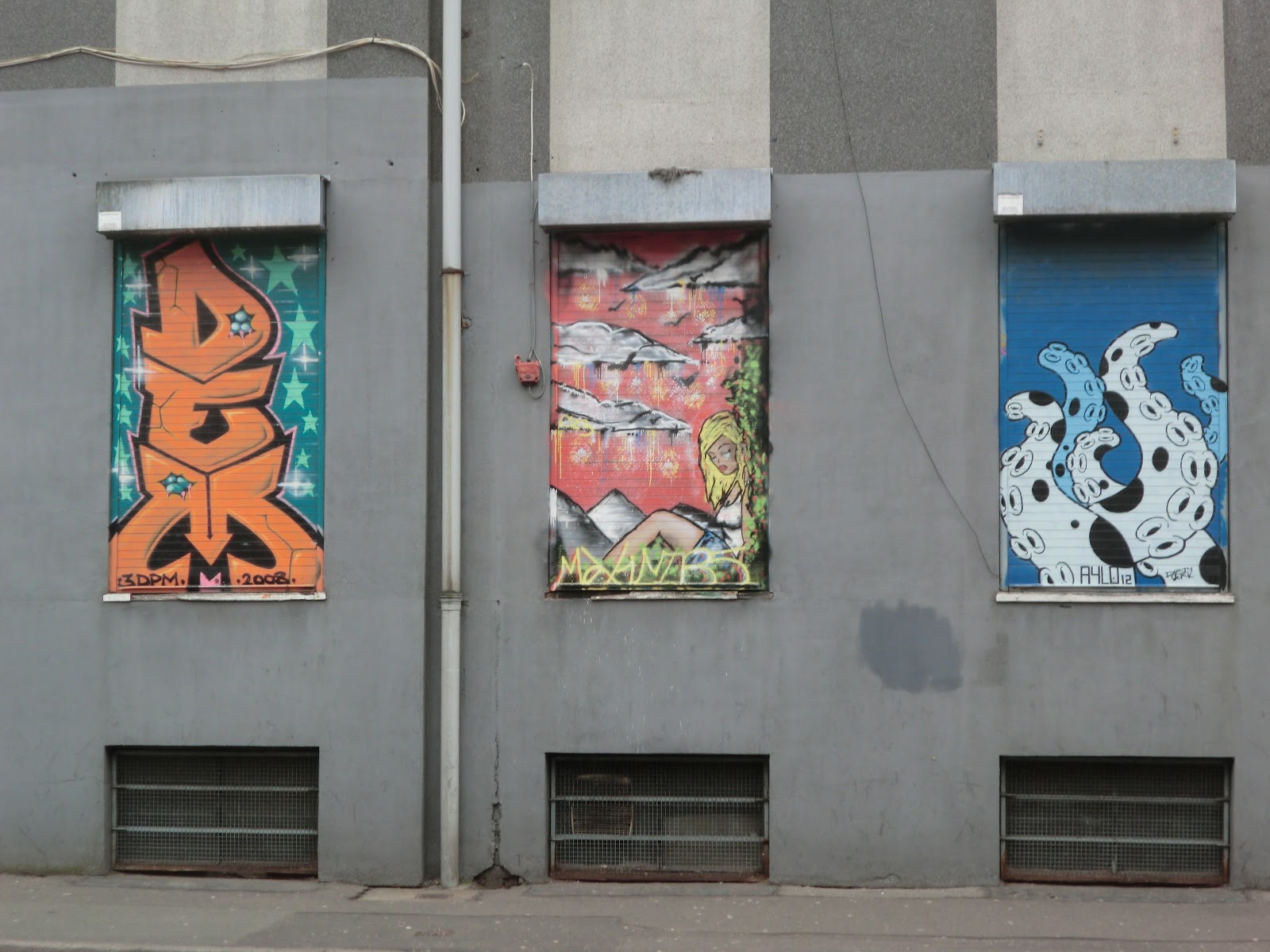
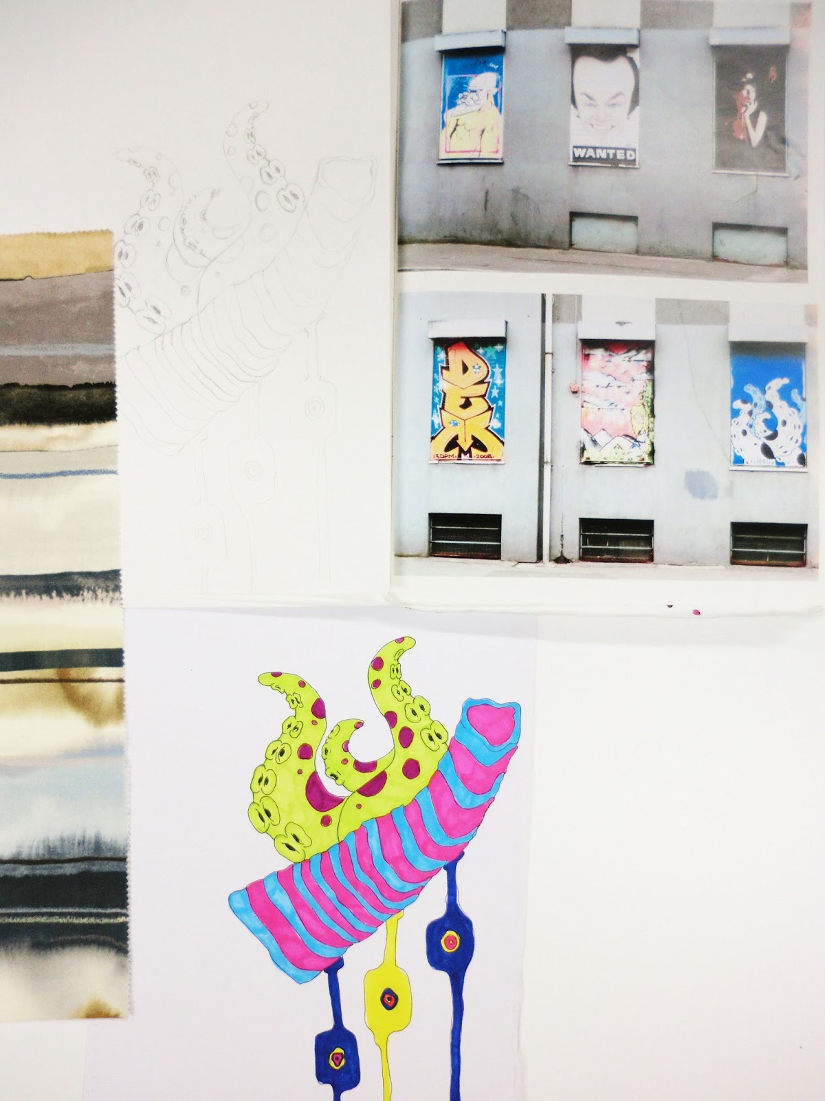
When we split from the group and began our own work I was personally interested in the first board, using bright colours and gaining inspiration from drag queens and carnivals. Although, after much thought I steered away from these themes for lack of exposure. I felt I wouldn’t be able to get enough visual inspiration, so I began looking into other areas within eccentricity. Graffiti being the starting point, gaining inspiration from the unusual colour combinations, use and freeness of lines, and the juxtaposition of shapes against words. I used colours from the images I had taken along with interior fabric samples from Harlequin. This use of bright colours, obscure shapes and freeness of lines is something I will take forward and experiment with.


Thursday, 16 May 2013

Introduction into Unit X


Unit x is about interdisciplinary collaboration, exposing us to engage with others like we would in the industry. It is also about seeing how others work, showing us new ways to approach a brief. For us in particular we only worked in groups for the first stage, a very different approach to starting a project but ultimately very useful as we all bounced ideas off of one another.

During this project I would like to improve my group skills, working in a design team is something I have in the past enjoyed but not had a lot of experience with. It is important for me to learn as much as I can about this group dynamic as in the industry it will be more likely I will be part of a team rather than a lone designer. I would also like to improve my confidence in my work, the last two projects I have not had complete confidence in my work, which brought it down. Through lots of market research (being aware of what other companies are producing), and commitment I believe I can change this.

This is the first time I will be designing for interiors as for the last two projects I have designed for fashion, and in particular menswear. I think my lack of knowledge in the area of menswear added to my lack of confidence, where as I have done a lot of research already into interiors. I went around Chelsea Harbour and collected samples of interior fabrics, finishes and textures. I have also been looking at relevant magazines i.e. The World of Interiors, and Ideal Home.  

I haven’t made any decisions yet about what I will be designing for, fabrics or wallpapers. I plan on creating the work and then seeing where it is appropriate for. I would like to learn about this area of textile design as it has interested me for a while, I feel after this project I will be able to accurately make a decision on where I want my career to go.

Thursday, 14 March 2013

Clashing colours

Clashing colours
Merging two images together to create an imgae of bold bright clashing colours and prints.


Found colour 2


I love this image-
paint on ridged metal gives it a
 unique texture, giving the image another dimention than just colour.

Found colour

ECCENTRIC


The unexpected

Unexpected Find

Alongside a bridge these bold murals appeared, they were so obsure in placement and theme. The colours were bright and expressive as were the images them selves.


Inspiration


The contrast of the artwork against the grey was so strikingly, I found this unusual misture of print as such agasint the mat dull concrete inspiring