Friday 17 May 2013

Evaluation

This project has been a pivotal moment in my textile degree, I have learnt a lot about myself as a designer and also about the industry. Before this project I had only designed for fashion, and this has opened my eyes to interiors and the many different areas it bleeds into. I have decided I would like to move my career forward as an interior textile designer, not specifically in what area of interiors yet though. Preferring interiors over fashion design has a lot to do with my knowledge of what is modern and acceptable, whereas in pervious projects I was not as aware of what was current. Another factor is the ability to be bolder when designing for interiors; I felt constraint when designing for menswear. It has been a massive change to what I am used to, as desining for interiors you have to work to a certain set of measurements. Which unfortunately I did not do with one of my prints until the end of the project when I had to edit the design, it would have been a lot easier and less time consuming had I done this from the start. Another factor is composition, because it will be on such a large scale the composition of a print is more noticeable. You also have to take into account (when doing wall paper) where the print will match up.

I have thoroughly enjoyed this project, partly because it is something new and exciting but also working towards a live brief. At first I was wary of being set a theme, feeling it was to constricting, but it was not at all. In fact the brief was very open an allowed me to express my ideas relating to the theme. This experience has given me an insight of how a design firm works; how they work as  team to produce a finished product, and how a company collaborate with one another. I would have like to have more interaction with the design team, so I could have had more input from them and accurately assess the client’s needs. This was an excellent opportunity as this is how I will be working in the industry, as I had  said before, it is most likely that I will be working within a design team rather than a lone designer.

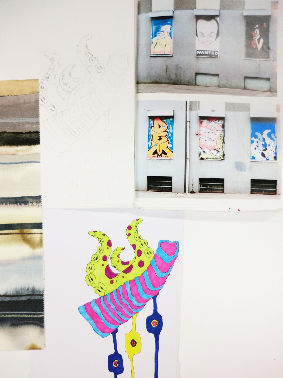
If I were to start the project again I would have created more prints in repeat, I particularly like the print using the graffiti drawing. I would have liked to furthered those designs into a full collection of children’s wallpapers.  Would have also started out working with the measurement’s the designs had to fit in, luckily only one of my designs was off and I could fix it, but it was very time consuming and could have been disastrous. I am happy with how my prints turned out although there is a little pixilation in a few of the images, but that is due to the print not printing more than 300 dpi.

This project has taught me to constantly evaluate and reflect upon my work, this method has helped me be critical when creating and choosing designs to work with. It has increased my confidence in my work, my ability to work towards another’s needs, and critique abilities. Interiors Company’s, after this project I feel I will be going into them with knowledge of the process, and learn much more on the industry which I can relate to my practice. I felt I responded well to the brief, but with more time I feel I could have produced a wider variety of designs, and possibly came up with a few more collections.


Continuation of work/ Dianne Harrison review

For the last section of my sketchbook I narrowed down the colours seen throughout my designs and picked 3 predominant ones, lime green, bright blue, and pinky/red. All three colours I felt accurately portrayed my initial word eccentricity. Using these colours I began to create textures that included my themes of sporadic movement and fluidity. I used a wide variety of mediums to create the textures some of which are; ink on wet paper, ink on dry paper, layering cling film and ink, sugar salt and bleach with ink, layering inks with acrylic paints, glue, glass paints, oil paints with and without water, pastels, plastics and re-working into images with stich and finally altering some with Photoshop, I also printed some of the designs onto acetate and layered them. After making all of the textures I began combining them with other textures and some with the prints and drawing I had previously done. Most of these combinations didn’t work, as they would either be too much or take away from each other, if I had more time I would have like to continue with this process until my designs were resolved.
At this time I started playing around with the scale of the textures and drawings, changing the scale gave the designs a new feel although some it just didn’t work with.


Dianne Harrison review

The Dianne Harrison interm review I felt was very useful to me as Greg gave me ideas on where my designs could be used, for example the shower curtain. I had never thought of using my designs in this context, but in the end is an idea I am using in my final collection. He also gave me reassurance in my work, I was worried it was too bright and inappropriate for interiors, but in the right context he assured me it would be fine.
Useful pointers like printing onto different mediums and continuing with the enlarging process, and mixing designs together also helped me progress my work.

Looking back through my work helped me differentiate between strong designs and the weaker ones. I lined up my favourites and printed them out small scale to see which ones worked well together. I had narrowed it down to seven designs ranging from wall papers, bedding and shower curtains. The collection was too cold, mainly using blues so I created another design using warmer pinks, purples and oranges to balance out the collection.
The 3rd design on the second row is the extra one I added into the collection.

 
 To figure out appropriate scale and use I put my designs into situations and used displacements. I put them into a variety of environments but I felt the collection would work best as a variety of uses, rather than just a wallpaper collection, but as bedding, wall paper and shower curtains.  The collection is bright and playful therefore I felt it would be most appropriate for children’s interiors. My thoughts from the beginning of the project until the point now have drastically changed, they have done so for many reasons. One being exposed to new ideas and uses of my prints (ie shower curtains) and another designing for children (being able to design colourful bold prints).

Progression of work/ Dianne Harrison studio visit


Still keeping in the theme of eccentricity I began exploring different areas so I would have a variety of images and information to work with.  During this time I went on a trip to New York and visited Moma, it was extremely inspirational. I saw iconic pieces of art that affected my view upon this project, drawing from the colours, textures, and movement I saw in the pieces and relating it to my practice. Artists such as Cezanne, Vincent Van Gogh, Pablo Picasso, Andy Warhol, Jackson Pollack, Claude Monet and many more impressionists cubists futurists inspired my project.


In particular a set of technical drawings of circuit boards (Intel corporation) interested me, the eccentric patterns seen in the lines and unusual colour combinations. I did a series of drawings from these, I layered them on different mediums (paper acetate) cut up and re-ordered them and manipulated them on Photoshop.  I experimented with the colours seen in the images through a much less controlled way of using inks and water.   I liked how they looked but I don’t feel I complelty resolved the designs, and didn’t mesh well with the collection.


Another piece that interested me was a geographical drawing of South America, the image combined ridged lines with coloured sections and I felt it worked well with the line drawings I had previously done along with the brightness of graffiti work. Using similar colours I started using marbling and then working back into the images to portray the movement. These ‘experiments’ had similar characteristics to an artist Hundertwasser, his work is very bright and unique. I did a few paintings inspired from his work and altered them through dragging the images across the photocopier; I did this to get a spontaneous unexpected outcome. The finished product was brilliant although, I was struggling to see where designs like the ones I had done would be appropriate in an interior setting.  Encountering this problem forced me to do more research into interiors company’s, I started researching into Cole & Son  as they have a few collections using unusual motifs, and also Alfeild which sell a variety of textures, wall coverings and leather from numerous designers and companies. 


Dianne Harrison visit
The visit to the Dianne Harrison studio was very insightful, especially to see how a studio works and how the members of the design team work together. I was surprised at the amount of interaction between hand processes and computer based designs. There was a lot of mood boards throughout the studio to express themes to the design team, this is similar to what we did in the first stage in groups. Obviously is a very useful way to communicate ideas, and also get ideas from. I think I will start using mood boards to brain storm ideas for projects in the future. 

Group work/Beginning of personal work


For this project we worked towards a live brief, which was an exciting new experience; I have never had the chance before to do so, especially for a company that sells their designs internationally. It is very different to what I am used to, as for the last two units I have chosen my themes to work from, whereas for this project I was given a theme and a group to work with. It is also an interiors brief which is a new area of design I have not explored, I have never produced any interiors prints before but it had always interested me and I thought it would be a good challenge.

Our word was eccentricity;  We worked as a group to gather relevant images, words and information. We split the board into two; one using bright bold images, and the other mainly using black and white. Luckily for us we worked well as a group, we all had different ideas of what eccentricity meant, but they overlapped in theme.  The division of work was equal and allowed everyone to express their ideas and thoughts. Working in a group was very useful, as we each brought something different to the mood board we created.

 For the first board we looked into different forms of art (futurism,  cubism, and abstract art) along with eccentric performances like drag queens and carnival artists. We also included clashing prints and fabrics. The second board focused on eccentric personalities and ways of thinking.  There are images of Salvador Dali, Vivienne Westwood, David Bowie and his numerous characters, and The Beat Generation with the artists associated with it like Henri Michaux and his mescaline drawings.


When we split from the group and began our own work I was personally interested in the first board, using bright colours and gaining inspiration from drag queens and carnivals. Although, after much thought I steered away from these themes for lack of exposure. I felt I wouldn’t be able to get enough visual inspiration, so I began looking into other areas within eccentricity. Graffiti being the starting point, gaining inspiration from the unusual colour combinations, use and freeness of lines, and the juxtaposition of shapes against words. I used colours from the images I had taken along with interior fabric samples from Harlequin. This use of bright colours, obscure shapes and freeness of lines is something I will take forward and experiment with.


Thursday 16 May 2013

Introduction into Unit X


Unit x is about interdisciplinary collaboration, exposing us to engage with others like we would in the industry. It is also about seeing how others work, showing us new ways to approach a brief. For us in particular we only worked in groups for the first stage, a very different approach to starting a project but ultimately very useful as we all bounced ideas off of one another.

During this project I would like to improve my group skills, working in a design team is something I have in the past enjoyed but not had a lot of experience with. It is important for me to learn as much as I can about this group dynamic as in the industry it will be more likely I will be part of a team rather than a lone designer. I would also like to improve my confidence in my work, the last two projects I have not had complete confidence in my work, which brought it down. Through lots of market research (being aware of what other companies are producing), and commitment I believe I can change this.

This is the first time I will be designing for interiors as for the last two projects I have designed for fashion, and in particular menswear. I think my lack of knowledge in the area of menswear added to my lack of confidence, where as I have done a lot of research already into interiors. I went around Chelsea Harbour and collected samples of interior fabrics, finishes and textures. I have also been looking at relevant magazines i.e. The World of Interiors, and Ideal Home.  

I haven’t made any decisions yet about what I will be designing for, fabrics or wallpapers. I plan on creating the work and then seeing where it is appropriate for. I would like to learn about this area of textile design as it has interested me for a while, I feel after this project I will be able to accurately make a decision on where I want my career to go.

Thursday 14 March 2013

Clashing colours

Clashing colours
Merging two images together to create an imgae of bold bright clashing colours and prints.


Found colour 2


I love this image-
paint on ridged metal gives it a
 unique texture, giving the image another dimention than just colour.